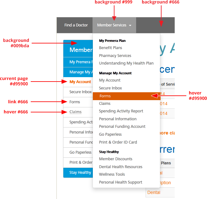
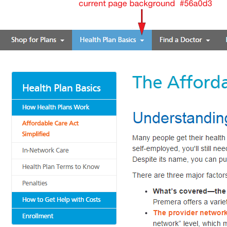
Changes need to be reviewed and approved by UX team. Consider when adding content:
- Can the new content replace or be added to an existing page?
- Global nav, secondary nav, Page titles, H1 titles and URLs need to match
How to build URLs
Follows same patterns as navigation, use dash (-) between words, and should ONLY be lower case. For non-secure pages do not use special characters like space,$,%,&,!,#.
Correct:
https://www.premera.com/wa/member/manage-my-account/forms/
Incorrect:
https://www.premera.com/wa/Manage_my_account/Forms/
Changing URLs
Changing URLs has significant impacts on our pages showing up in search and breaking external links to our websites. Please use 301 HTTP status
code redirects when a page is removed, replaced or consolidated. The forwarding URL should point to the most relevant page; this is called mapping URLs. If a match can't be found then point to main landing page or home URL like Premera.com/visitor.
Removing URLs from search results
Please work with Karlyn and Sarah when removing one or more pages. Updates will need to be made in the webmaster account.
- If the page no longer exists, make sure that the server returns a 404 (Not Found) or 410 (Gone)
HTTP status code. Non-HTML file (like PDFs) should be completely removed from your server.
- If the page still exists, use
robots.txt to prevent Google from crawling it. Even if a URL is disallowed by robots.txt we may still index the page if we find its URL on another site. However, we won't index the page if it's blocked in robots.txt and there is an active URL removal request for the page.
Errors
All pages should be coded to display the friendly version of the Error page for all 400 and 500 HTTPs errors. This allows our customers and bots crawling our sites to return later and eliminates dead-ends.
Drop down menu and left navigation

